Your Starting PCI Changes Everything: Understanding the Pavement Aging Curve
In the last post, we modeled what happens to a city's average PCI over 20 years at different budget levels — and found that the $20,000/centerline mile rule of thumb holds up reasonably well for a network starting at a PCI of 66. But we left a question on the table: what if your network is in worse shape? Or better shape? Why does starting condition matter so much?
To answer that, you have to understand the pavement aging curve.
The Curve Isn't a Straight Line
This is the part that surprises a lot of city officials when they see it for the first time. Pavement doesn't deteriorate at a steady, predictable rate. It follows an S-shaped curve — holding up reasonably well for years after construction or major rehab, then accelerating through a middle "crumble zone," and eventually bottoming out in the Very Poor range where the rate of decline slows only because there isn't much further to fall.
The chart below shows two versions of this curve. The blue line is the Shahin-Walther model, originally developed for the Army Corps of Engineers and widely used in pavement management. The red line is a custom family curve, the kind you'd develop through field observation across your actual road network. The shapes differ in the details, but the fundamental behavior is the same.
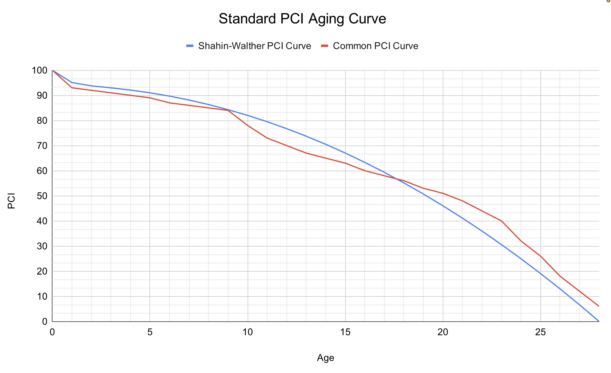
Two versions of Pavement Condition Index aging curves for a road network
Slope Is the Key
What changes between these curves — and between different networks — is the slope at any given PCI level. The chart below adds tangent lines at several points along each curve to make this visible.
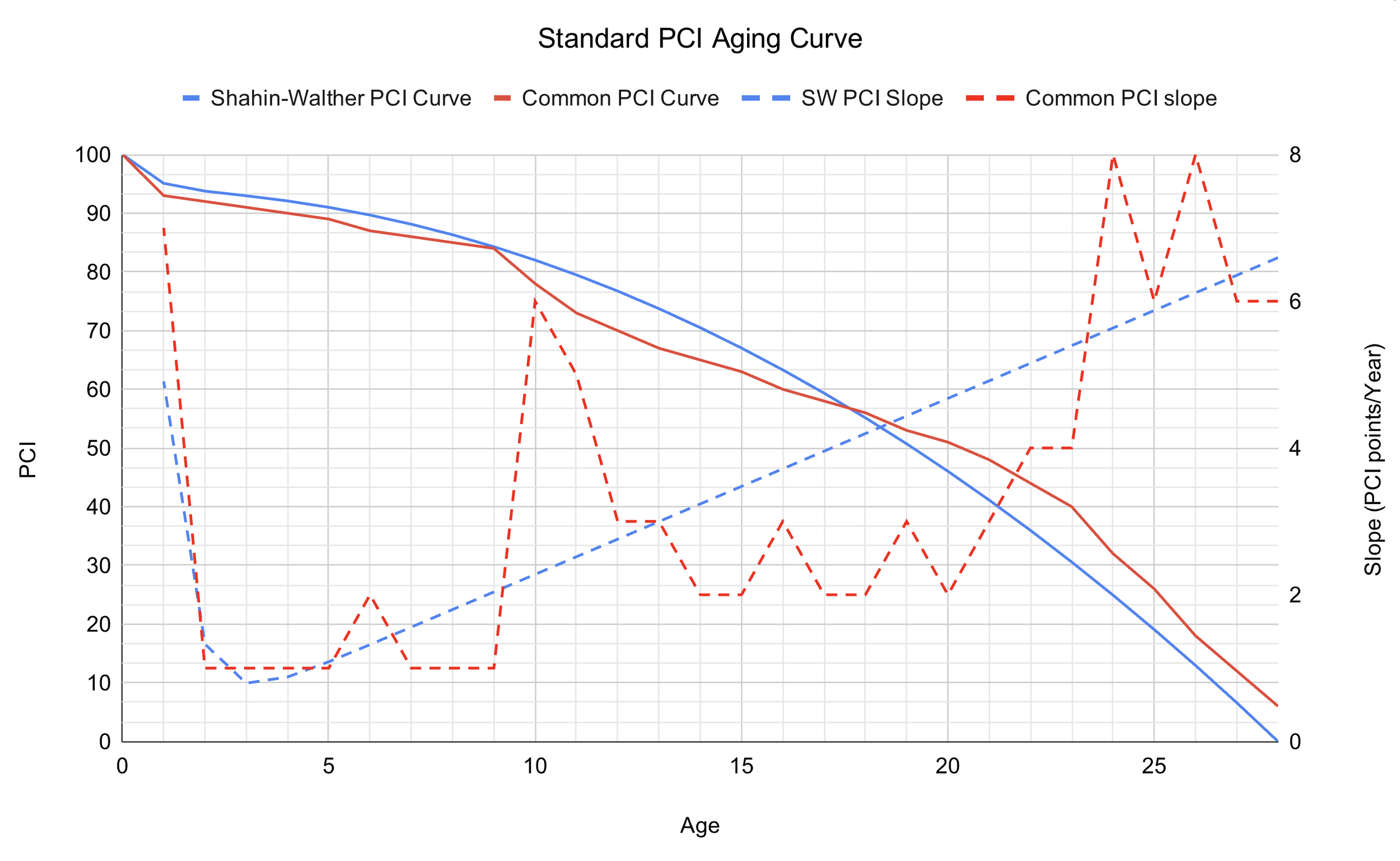
The dashed lines highlight the slope of the aging curves
The slope tells you something critical: how hard you have to fight to move that number. When average PCI is high, the slope is gentle. Roads are aging slowly and respond well to low-cost preventive treatments. As average PCI drops into the 50s and 60s, the slope steepens. Roads that were candidates for cheap preservation work are now crossing into rehabilitation territory. The cost per point of PCI improvement starts climbing.
Below PCI 50, the math gets brutal. Roads in the Poor and Very Poor range often have structural failures that can only be addressed with full-depth reclamation or reconstruction — treatments that don't just cost more, they pull budget away from the rest of the network while the roads you didn't treat keep sliding down the curve.
The "Crux" Ranges
On the custom red curve in particular, you can see that the slope isn't uniformly increasing as PCI drops. There are certain ranges where deterioration accelerates faster than the trend on either side — points where a city has to exert disproportionate effort and spending just to push through. Getting a network's average PCI over one of these crux ranges costs more than the ranges on either side would suggest.
This is one reason why two cities with the same average PCI can have very different budget needs. The distribution of conditions across your network matters as much as the average.
In the next post, we'll step back from the mechanics and ask a more fundamental question: what is a pavement maintenance program actually trying to accomplish? The answer shapes everything else.
Curious what your city's PCI trajectory looks like? Reach out — we're happy to walk you through it.